
PROJECT SPOTLIGHT: STR/EATS CAFE

With covid-19 among us and classes becoming virtual, students find themselves trapped at home causing them to lose access to school meals. Some are afraid to admit it, but there are students who rely on school breakfast and lunch to have enough to eat everyday. I myself was one of those students. (Learn more about food insecurity in Baltimore City on this website created by Wide Angle student Nalin Cooper.)
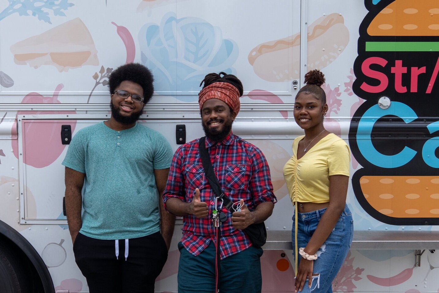
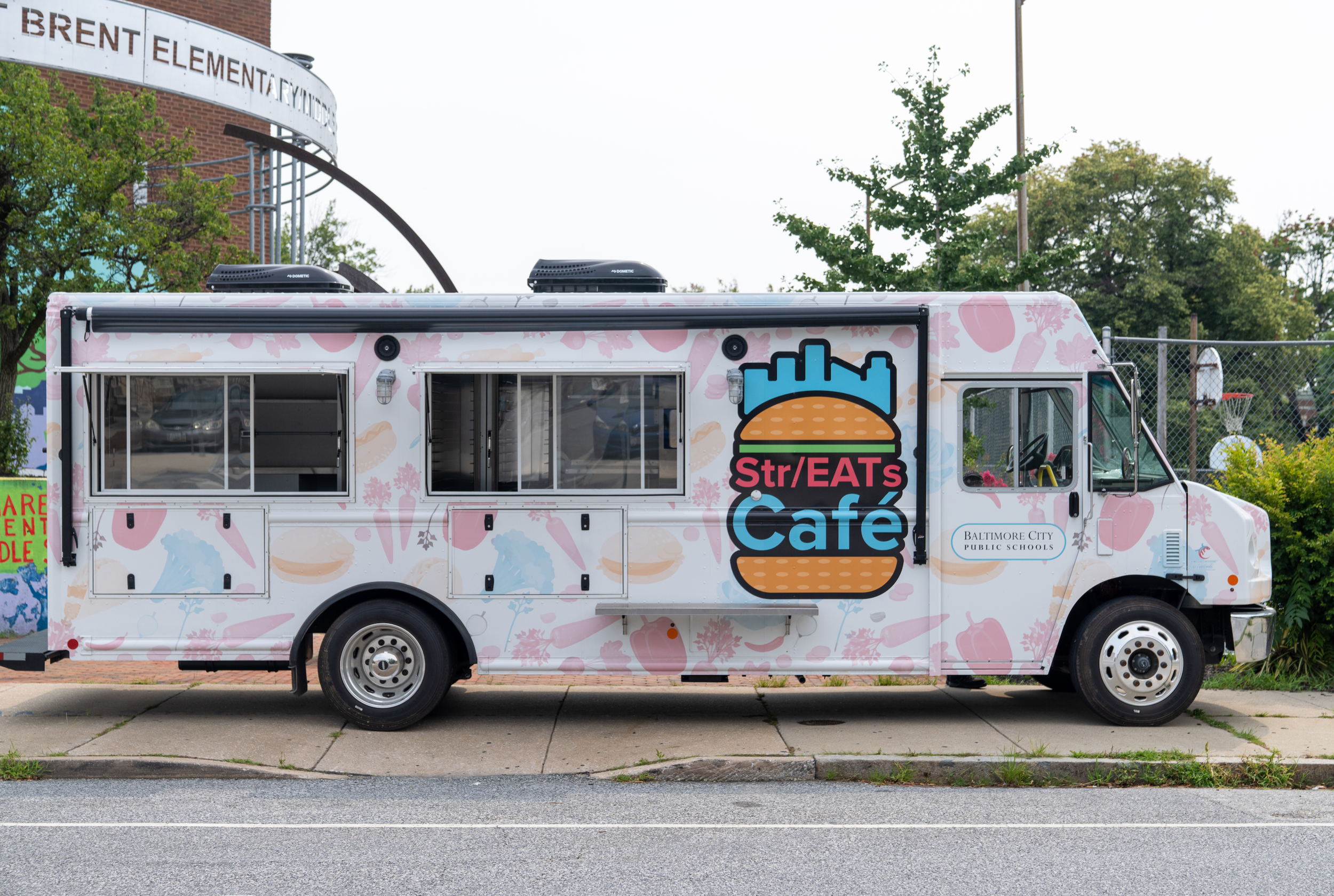
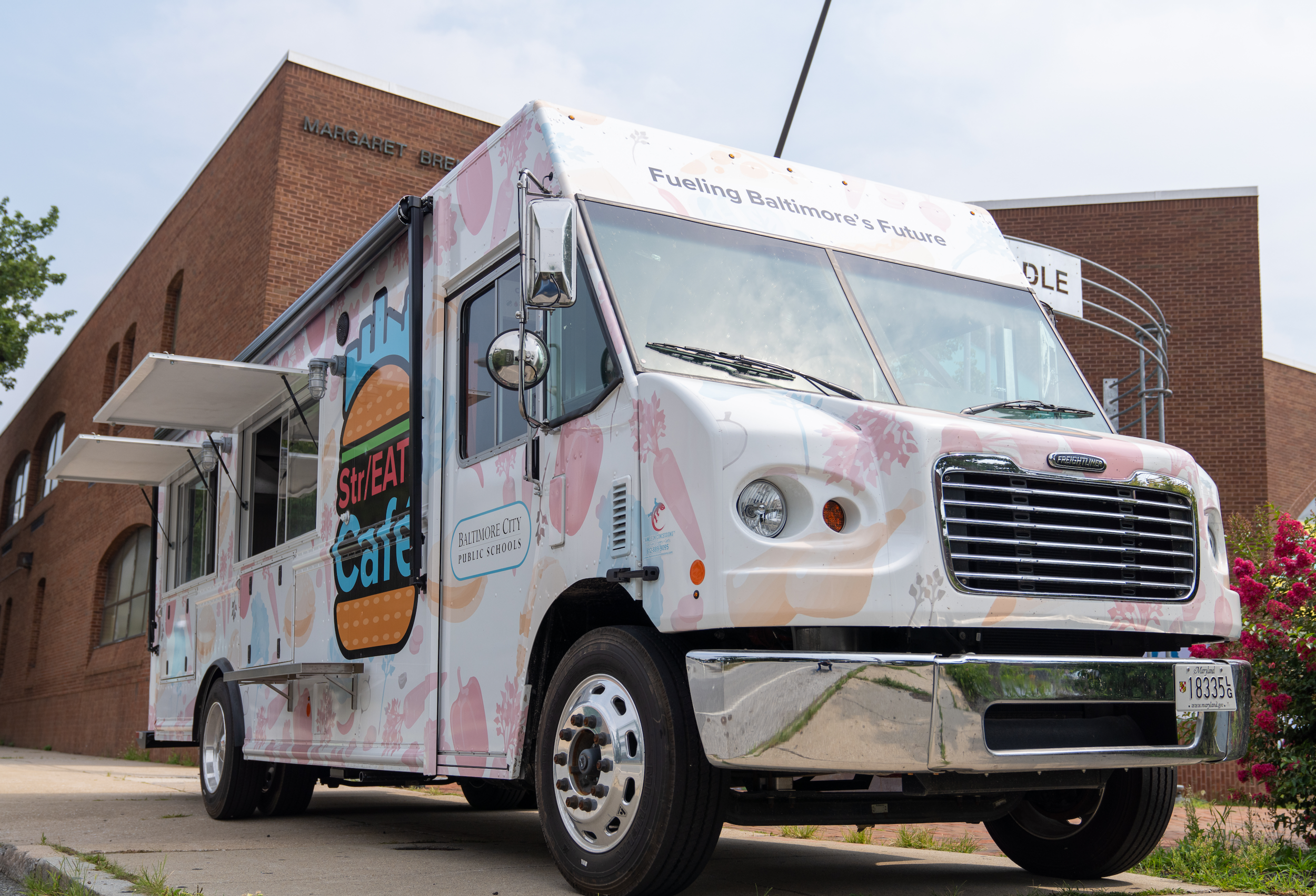
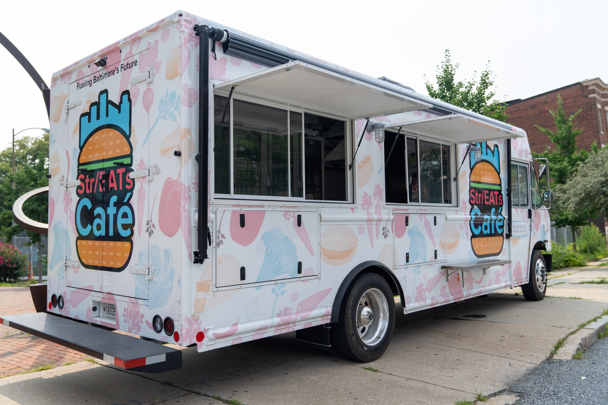
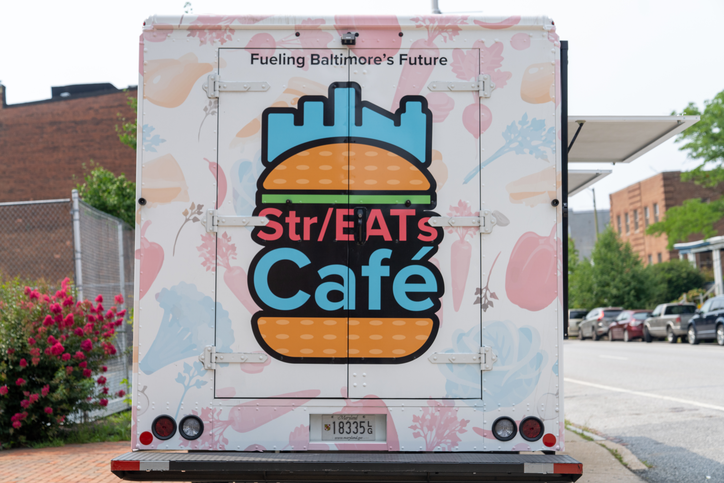
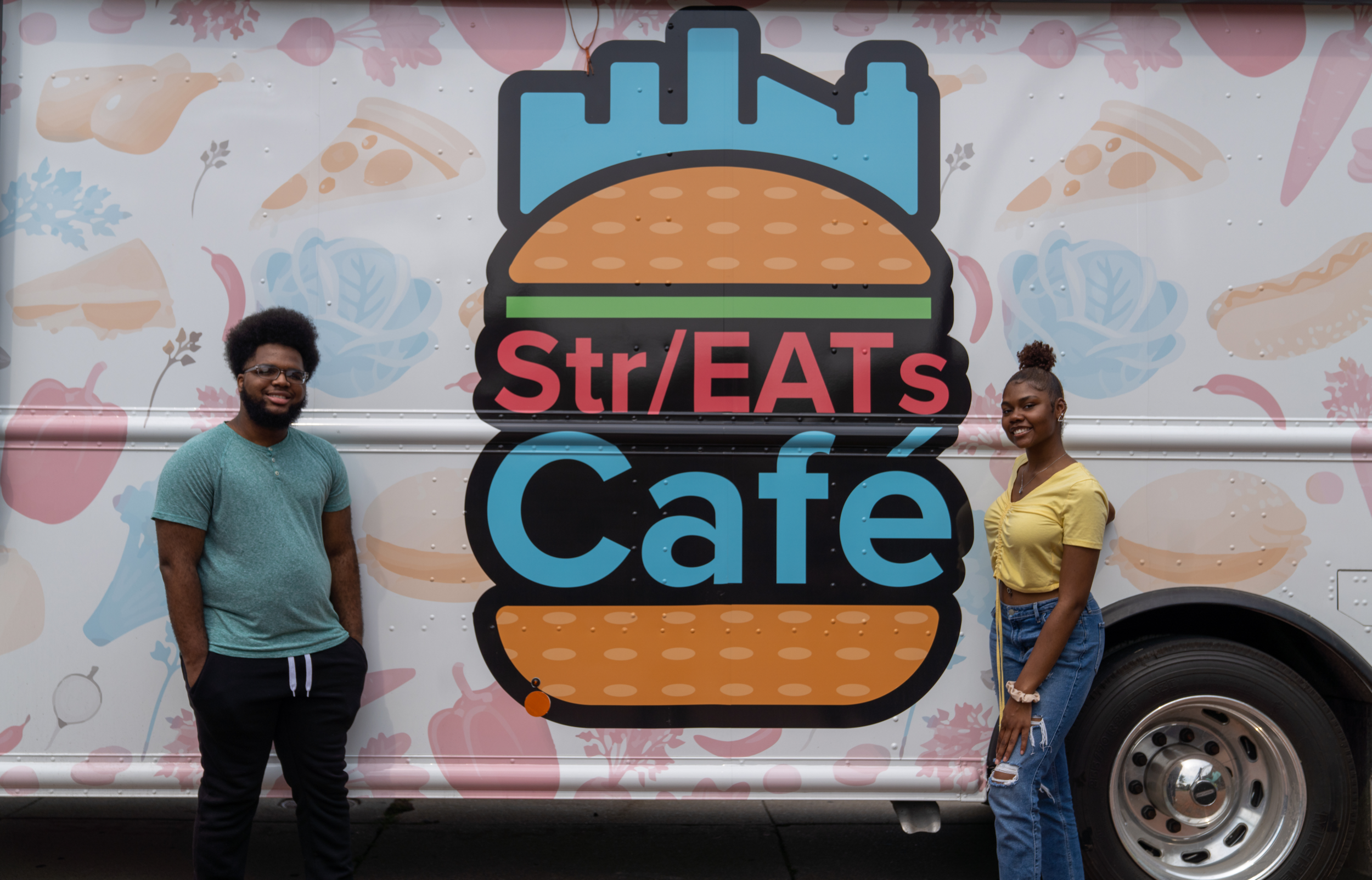
Wide Angle’s Design Apprentice team partnered with Baltimore City Public Schools (BCPS) to help with their Food Truck initiative. The goal is that food trucks will be used to stop in communal spaces in Baltimore City during quarantine to deliver free breakfasts and lunches to students. The food trucks will ideally also be brought in to deliver meals during school closings for maintenance or other issues. The aim of this initiative is to destigmatize and increase participation and flexibility for school meal operations. The Design Apprentice team was responsible for designing a logo, vehicle wrap, and social media advertising for the food truck. My job specifically was to design their logo. I began on paper taking the name ideas we had and basing the designs around them.

I created a logo in the shape of a truck inspired by the title, “Charm To Go,” using the O’s as wheels.

I created an arrow going in a circle with Baltimore’s skyline above it for the title, “City Eats Mobile.”

And finally, I created a design with a hand holding up a food plate with the words, “Our Treat Mobile.”
But none of these really worked for the client. They felt like a logo of a truck on a truck was redundant, a platter didn’t accurately depict the type of food they would be serving, and the arrow didn’t make it clear that the truck sold food.

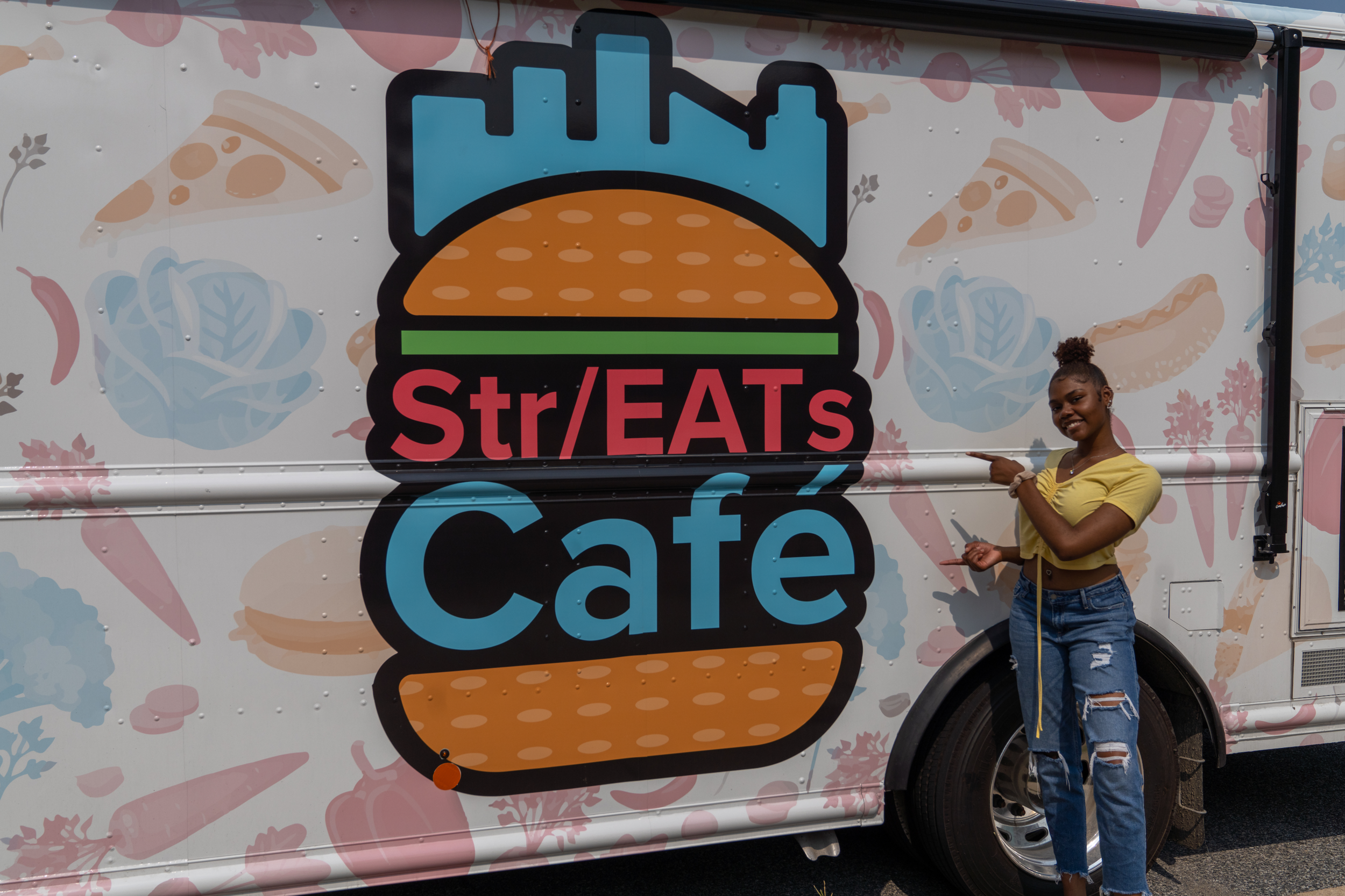
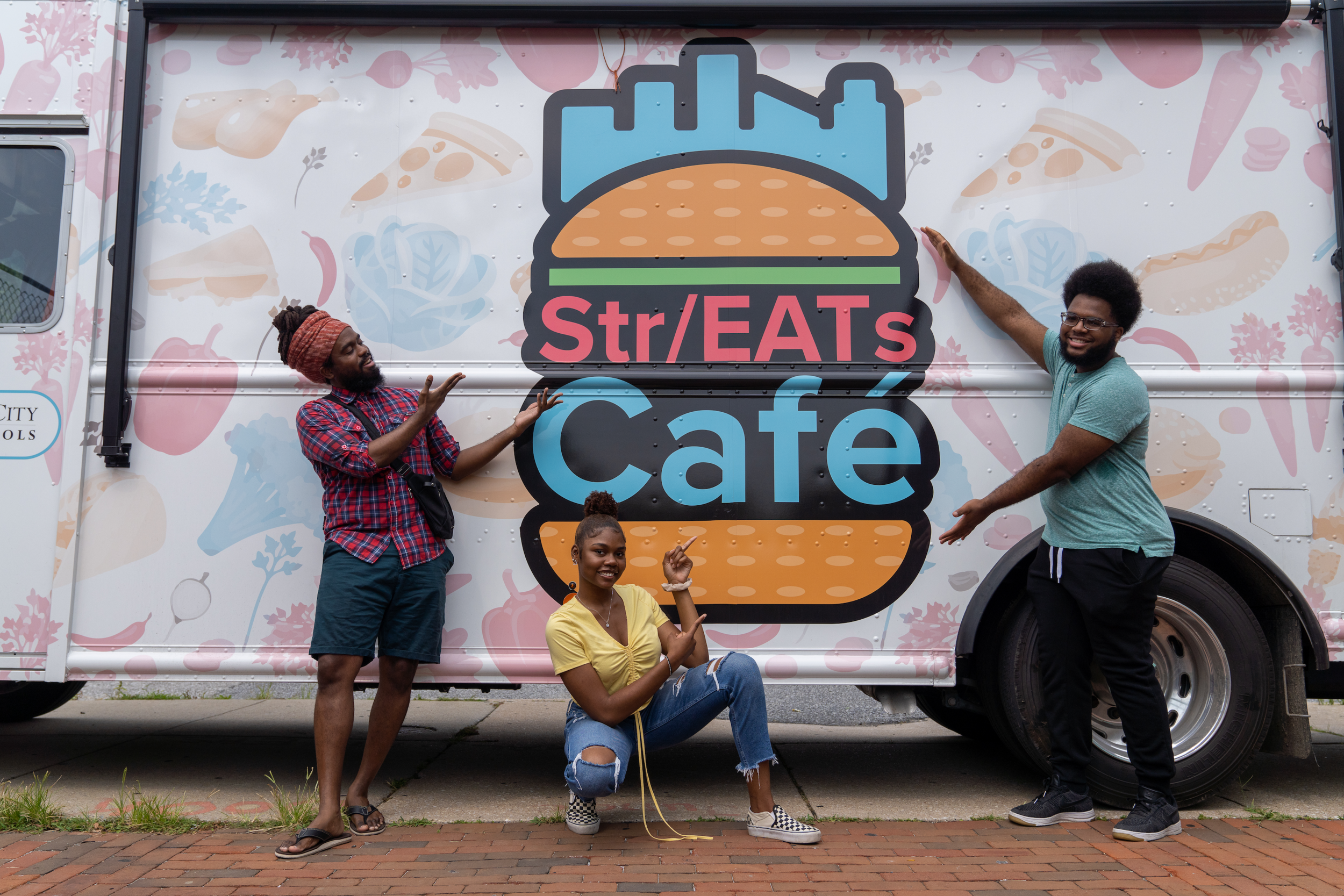
A piece of advice I was given from my supervisor was to make sure the logo clearly designates the truck as one that sells food. Then it hit me that the logo should be an easily recognizable food that schools serve. I designed a burger with the final title we decided on between two buns colored as meat, cheese and lettuce, with the Baltimore City skyline above it. This logo - with its bright colors and clear connotation - resonated very well with the clients and was the ultimate choice!
As a graphic designer the projects I particularly love to work on are ones that required me to make a logo. Logo design is so fun to me because it reminds me of designing a character. Trying to create something unique yet easily identifiable and clear at a glance is a challenge I truly love.
If you’re interested in having me create a logo for you I am currently accepting new clients, so if anyone reading this is in need of design work please feel free to contact me at Deshaunfortune@gmail.com with the subject line “Freelance Opportunity.”

MEET THE AUTHOR
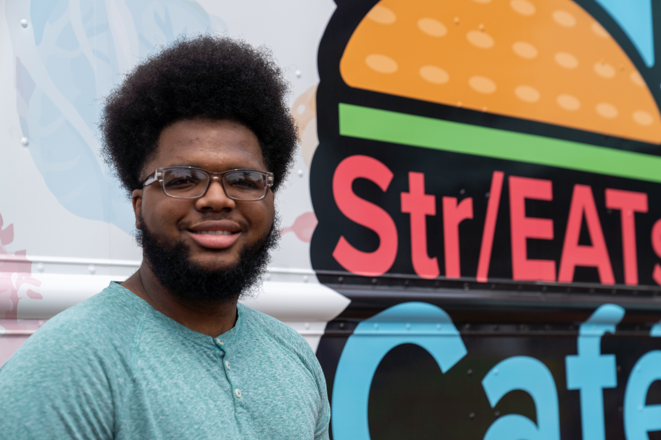
De’Shaun Fortune, born and raised in Baltimore, has been studying graphic design since age 12. Before Graduating from Baltimore Design School, De’Shaun studied graphic design for 7 years including participating in Wide Angle Youth Media's after school Design Team. Now in college majoring in Art and Interactive Media, he is one of Wide Angle's first Design Apprentices with the goal of using the skills he has developed to promote unity and acceptance.